grandMA3 User Manual Publication
Edit Layout Elements
|
grandMA3 User Manual » Layouts » Edit Layout Elements
|
Version 2.2
|
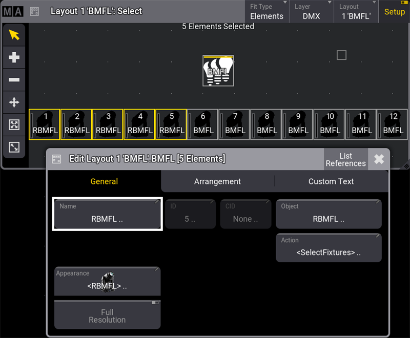
To edit a layout element:
- Tap Setup to enable the setup mode in the Layout View window.
-
Tap
 and open the element with the 2 Finger Edit.
-Or-
- Tap Setup to activate the Layout Encoder Bar.
- Select the layout elements to edit in the Layout View window.
- Tap Edit Selected in the Layout Encoder Bar to open the layout element editor.
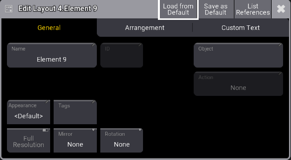
The Edit Layout window is separated into three tabs: General, Arrangement, and Custom Text.
General Tab
Manages all properties regarding the object assigned to the layout element.
Edit Layout Elements
- Name: Opens the virtual keyboard to enter a name for the selected element.
- ID: When a fixture is assigned to a layout, the fixture ID is displayed here. For more information, see What are Fixtures. When a pool object is assigned, ID represents the pool object number.
- CID: If the IDType is something different than "Fixture", the CID is displayed here. For more information, see Add Fixtures to the Show.
- Object: Opens the Assignment Editor pop-up.
- Action: Opens the Select Action pop-up. Select an action to be performed when tapping an element.
- <Layout Default> will follow the action set for the default layout element. See Create a Layout.
- When set to <Object Default>, it follows the object action of the object itself.
- Appearance: Opens the Select Appearance pop-up. <Default> will use the appearance of the assigned object. For more information, see Appearances.
- Full Resolution: Defines if an image is displayed with its full resolution (enabled) or reduced quality (disabled).
- Mirror: Mirrors the displayed appearance horizontally, vertically, or equally on a layout element.
- Appearance Rotation: Rotates the displayed appearance to 90°, 180°, or 270° degrees.
Layout element defaults can be created by tapping Save as Default in the title bar. Defaults can also be set by pressing Menu and tapping Preferences and Timings.
 |
Important: |
|
Having a lot of high-resolution images displayed may slow down the graphical user interface. In this case, the software falls back, rendering images with a lower quality. Images with 150 pixels or below will always be displayed with a lower quality.
|
Arrangement Tab
Manages the position and look of a layout element.
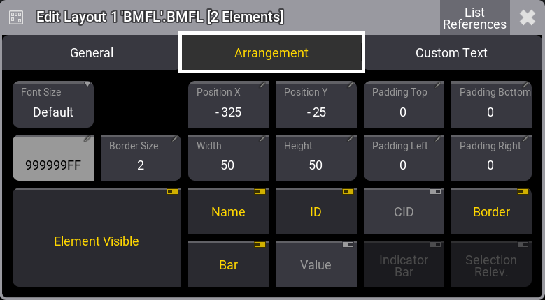
- Font Size: Use these buttons to personalize the custom text alignment. Setting layout elements to a dedicated font size displays the text in the set size.
- Position X and Position Y: Specify the position along X and Y in the layout.
- Padding Top, Padding Bottom, Padding Left, Padding Right: Padding is the distance between the edge of the element and the content inside the element.
- Border Color and Border Size: Adjust the outline color and size.
- Width and Height: This is to adjust the dimensions of the element.
- Element Visible: Toggle to display or hide the element.
- Name, ID, CID, Boarder, Bar, and Value: Toggle to display or hide the name, the fixture ID, the custom ID, the dimmer bar, the output value, and the border of the layout element.
- Indicator Bar: When a pool object is assigned to a layout (e.g., a group), it defines if the indicator bar will be displayed on top of the element.
- Selection Relevance: When enabled, the image of the layout element will be colored with the For All or For Some color. For more information, see Window Settings, Pool Settings.
Custom Text Tab
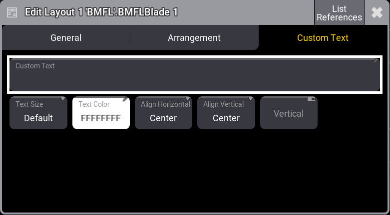
- Custom Text: Add a custom label to the element. Text on layout elements that is too long to display is cut off.
- Text Size and Text Color: Use these buttons to personalize the custom text size and color.
- Align Horizontal: The horizontal custom text alignment.
- Center: Will align the text to the horizontal center of the layout element.
- Left: The left end of the text will be aligned with the left edge of the layout element.
- Right: The right end of the text will be aligned with the right edge of the layout element.
- OutsideLeft: Places the custom text outside the layout element on the left.
- OutsideRight: Places the custom text outside the layout element on the right.
- Align Vertical: The vertical custom text alignment.
- Center: Will align the text to the vertical center of the layout element.
- Top: Place the text within the layout element at the top edge.
- Bottom: Place the text within the layout element at the bottom edge.
- Above: Place the text outside the layout element at the top edge.
- Below: Place the text outside the layout element below the layout element.
- Vertical: Displays the custom text in a perpendicular direction when enabled.
 |
Hint: |
|
Multiple selected layout elements can be edited simultaneously. |
|
Hint: |
|
The layout element selection order will determine the alignment order.
|
|
Hint: |
|
When toggling layout element properties while having multiple layout elements selected with different property values, they will switch to the same value and change their value together.
|
Example
To edit multiple selected layout elements simultaneously:
- Tap Setup in the title bar to enable Setup.
- Select various fixtures in the Layout Viewer window.
- Tap Edit Selected in the Layout Encoder Bar to open the layout element editor. For more information, see Layout Encoder Bar.
- Tap the Name button; this opens the virtual keyboard. Enter a new name and tap Enter.
- Close the Edit Layout dialogue.